Circ client, STM Bags, has been recognized by iLounge as “2012 Accessory Maker of the Year,” the site’s annual Readers’ Choice award.
If you’re a hoarder of Apple iDevices, you may have heard of iLounge, one of the most comprehensive publishers of reports and information about Apple’s mobile products and the myriad of related accessories. At over 20 million page hits each month, iLounge has become a go-to source with it’s editorial reviews, forums, and resources for informed iConsumers.
Since our initial design and launch of stmbags.com in the spring of 2010, Circ has been a part of the creative and technical force behind STM’s website, helping the company reach retailers and customers online. At Circ, we feel an enormous sense of pride when a client brand is appreciated for quality, creativity, and excellence in their market. Congratulations to our colleagues at STM, notably Adam Ziegelman and team.
An excerpt from the press release:
SAN DIEGO, /PRNewswire/ —
Leading Australian bag and case manufacturer STM has won the prestigious iLounge Apple Accessory Maker of the Year Award. iLounge’s annual Readers’ Choice Awards recognizes third party developers for their excellent work throughout the year.
“We are thrilled to be recognized by iLounge and their readers,” said Adina Jacobs, STM’s co-founder. “It is always nice to be acknowledged as a leader in your field and coming from iLounge makes it more special.”
“After thousands of votes—and very passionate, neck-and-neck tallies up to the very last minute—STM prevailed as iLounge’s Readers’ Choice for Accessory Developer of the Year,” explained Jeremy Horwitz, iLounge’s Editor-in-Chief. “Our editors have loved STM’s bags for years, and have been thrilled to see its recent and impressive expansions into iPad and iPhone case development. We can’t wait to see what’s next.”
Hundreds of new Apple products are tested every year by iLounge. For the Readers’ Choice Awards, iLounge nominated a select group of organizations deemed by their editors as leaders in their respective fields. Winners were determined solely by thousands of iLounge readers who cast their votes throughout the month of October. STM joins other 2012 winners such as Google, Apple, JBL and Disney.
—
Learn more about STM Bags at www.stmbags.com.
We all enjoy the little details in life that make our experiences simpler and more memorable. The same is true for web and mobile applications. But these little details are anything but little in their role in the user experience as a whole. They make our interaction with the device easier and faster, and sometimes even bring a smile to our faces.

Think about it. When you visit a new website or download a new app, what are the things that make you bookmark the website or keep you from deleting the app? Does the design and functionality enhance your overall experience? Does the application subtly guide you to your desired outcome, helping you along the way without getting in the way? The details might be so subtle that you don’t notice them at first, and maybe you’ve seen them so many times in different applications that they’ve become second nature and even expected.
The first and foremost priority in building a web or mobile application is always to satisfy the needs of the user and the business. Nevertheless, it’s the execution of the basic needs and little details that make all the difference, that make a good application great. Paired with a solid core application—one with good design and functionality, well-written content, and interesting or helpful subject matter—clever details can take the application, and more importantly the user’s experience, to the next level and beyond.
An application that demonstrates an understanding of our needs and desires can be very powerful on an emotional level, alongside the aesthetic and functional levels. For example, have you ever noticed that the street view icon in Google Maps has a surfboard in Hawaii? Or that Google Maps also advises against going to Mordor? These details don’t interrupt the application’s function or get in your way, but they add a touch of personality that makes the application feel less static and more inviting.


Say you’re comparing two new apps with the same basic function. They both look good aesthetically and the writing is clear and meaningful. But one app uses date and time pickers, auto-populates your user information and location, and smoothly handles device orientation changes. The other requires you to type in the date, time and location repeatedly, painstakingly input all your user information, and is forever stuck in landscape orientation. Both apps allow you to achieve the same goal, but the first app makes it much easier and faster. Which would you keep?
Here at Circ, we’re all about paying attention to the little details, about going the extra mile to create the best applications and experiences possible for businesses and their customers alike. And at the end of the day, that’s what counts.

Circ worked with HealthCommunities.com to redesign and rebuild their web content structure and interface, and prepare it for Content Management integration. The success of the design has enabled the HealthCommunities brand to leverage the editorial assets of its parent company, Remedy Health Media, create a renewed focus, convert user registration, and foster ongoing engagement.
As part of Remedy Health Media‘s trusted family of award winning products, HealthCommunities.com is an online health and wellness resource that covers over 650 diseases and conditions and offers a range of articles, tools, and apps on health topics for women, men, kids, and even pets. HealthCommunities.com adds value to the lives of its audience on a daily basis by serving as an interactive hub for all things “Health,” and develops meaningful conversations within its user-base.
But even with a strong parent brand and comprehensive offering, the HealthCommunites.com brand is challenged to differentiate itself in a crowded environment entrenched with major players like WebMD.com and EverydayHealth.com.
To improve the user experience and brand differentiation, Circ provided HealthCommunities.com with:
– New, clear, information architecture
– A clean, fresh, open experience with a friendly and intuitive user interface
– Functionality that is suited for both desktop and mobile environments
– Improved, consistent navigation accessing health topic landing pages and dynamic article pages
– Interactive tools for social sharing and audience participation via polls and quizzes
– Seamless integration of content and products from partners Johns Hopkins and UC Berkeley
– Integration of the Remedy Health Media suite of tools and apps
At Circ, we understand that all great brands live in conversations, and we design new and creative ways to engage consumer audiences. To that end, the HealthCommunities.com design was a strategic effort in the evolution of their brand. Partnering with HealthCommunities.com has not only sparked meaningful conversations within its user-base, allowing more positive relationships to form between the brand and its consumers, but has also lead to positive business results for our client and ourselves.
“We had a really solid partner in Circ for this project,” says Patrick Assey, EVP of Digital at Remedy Health Media. “They understood our challenges and goals and worked with us diligently to overhaul our site experience. The outcome is a site that’s much more intuitive—one that has end-users and advertisers alike singing our praises!”

As any marketer will tell you, introducing a new brand to the marketplace is a big task—one filled with many exciting possibilities, but requirements and unknowns as well. What’s the brand story? What’s the platform where we’re going to tell it? And most importantly, how are we going to get people engaging with, talking about, and buying the product?
This was exactly the case as Circ partnered with the TriLipid Research Institute LLC to facilitate a website market test for their skincare brand Trilipiderm®. After helping launch the product, it became clear that we needed to evolve the brand story on the website. But we needed to do it within the confines of their existing ecommerce platform, Shopify, and enable access and engagement from the homepage.
The new homepage has interactive features like sliding panes, scrolling images, imbedded videos, and buttons for expanded reading. For the brand, presenting its evolved story to the world and engaging customers is an important step in its growth. Plus, incorporating keywords and authoritative content boosts the brand’s search rankings, bringing potential new customers to the site.
For Circ, the new homepage is a creative solution that meets the client’s needs within specific guidelines on the Shopify platform. It’s a fresh aesthetic with optimized content in a sticky, interactive feature, and it’s all in one place.

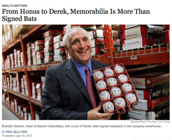
It seems that when Derek Jeter hit his 3,000th hit on July 9th, everyone wanted something that the Yankees’ living legend had signed, touched, or even walked on. That’s why the New York Times just featured our client, top memorabilia shop Steiner Sports, as baseball’s go-to online warehouse for sports collector items.

From dugout dirt to signed baseballs and game-used bats, Steiner Sports is the headquarters for any-and-all kinds of baseball collector items. And they don’t stop at baseball—the website features all manner of sports memorabilia from hockey to horse racing.
Steiner Sports asked Circumerro to design their website back in spring 2011, and we couldn’t be prouder of their coverage in the Times, or of the tidal wave of orders they experienced over Jeter’s 3000th hit.
So if you’re looking for anything from a signed photo, to game-worn pants, from autographed helmets to bricks from old Yankees stadium, stop by Steinersports.com, where Circumerro’s creative work connects fans with their favorite sports memorabilia.
Our client, Kanban Logistics, was featured during their industry conference, International Warehouse Logistics Association, for both the quality of their Web site and the web video Circumerro shot for them.
Harold Hobgood, Business Development Manager of Kanban says, “Randy Stephenson (Senior Software Analyst) with Camelot Software out of Charlotte, NC took time to tell everyone at the meeting that he wanted to compliment Kanban on our website and most importantly our video. Randy stated that everyone needed to take the time to look at our video. After the meeting when we were on the way home we received an email from the President of the IWLA stating how impressed he was over the video.”
Harold went on to say, “Latham I have always said that the video was the best thing we have ever done to help advertise our company and after attending this meeting it just re-affirms what I have said. I feel we are currently ahead of most of our competition in this area and it really has been a proud moment. Thanks for all your help and your staff’s help with everything.”
Kanban displays the video on their website, but what is really interesting is the fact they have over 24,000 views on YouTube. YouTube insights reports the views are 81% male and between the ages of 35-54, which is their sweet spot for who they want to be targeting. These views are in addition to those prospective clients who watched it on Kanban’s website.
Web video continues to provide value in many ways in helping businesses tell their story in an authentic way. It raises your visibility in search engines and is an easy way for a prospective client to be sold on your product or services.

We signed Steiner Sports as a client! Based in New Rochelle, New York, Steiner Sports is a leader in autographed sports memorabilia and sports collectibles. Circumerro is charged with concepting and designing a new website.
“Steiner Sports is the top dog in sports memorabilia & collectibles. They recognized our work in eCommerce and creating sites that convince and convert,” said Latham Jenkins, president of Circumerro Media.
The new site, once completed with Circumerro’s eCommerce partner, Acadaca, will be launched in the fall of 2010.
About Steiner Sports
Steiner Sports Memorabilia entered the sports business world in 1987 and has established itself as the leader in autographed sports memorabilia and sports collectibles. Their full line authentic autographed collectibles are the best source for all your gift needs. They have the perfect sports gifts for birthdays or unique gift for men (groomsman gifts or anniversary gifts). The current best-selling autographed memorabilia are items from: Yankees, Red Sox, Cowboys, Giants, Rangers, Mets, Celtics, Alabama Football Memorabilia, Notre Dame Football, Derek Jeter, Alex Rodriguez, Eli Manning, Mark Buehrle, Brett Favre, Mark Teixeira and Mariano Rivera. Featured this month are special collectibles featuring World Series memorabilia from the New York Yankees and Philadelphia Phillies.

HomesteadMag.com, the online counterpart to Homestead, went live today with a collection of new content. The 10th Anniversary Issue of Jackson Hole’s premiere resource for art, architecture and interior design hit shelves earlier this spring, and now readers can access the same original articles and resource directory listings online.

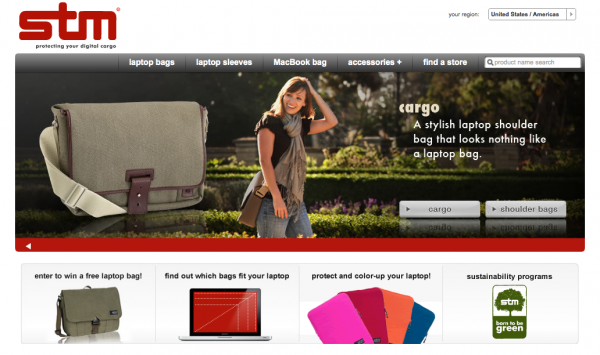
Circumerro Media announces the launch of a new website for STM Bags at www.stmbags.com. As a leading innovator in laptop bag designs, STM turned to Circumerro’s expertise in helping premier brands share their stories effectively and efficiently online. With project goals of developing a site design and platform for the STM Australian and U.S. markets, Circumerro incorporated their veteran practices to construct a head-turning site for STM.

Circumerro Media, a web design, publishing and branding agency, announces the launch of a new website for Carney Logan Burke Architects at www.clbarchitects.com. Boasting a contemporary design, search-friendly architecture and a compelling portfolio of projects, the site reinforces Carney Logan Burke Architects’s commitment to blending innovative design with natural beauty.
