When shaping the strategy for a web site or application in planning and budgeting efforts, it’s essential to consider the mobile solutions needed to be successful.
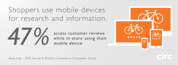
The studies are in, and all signs point to a massive increase in customer activity on mobile devices. Studies by Forrester, comScore, Gartner, and Nielsen reported similar findings in the neighborhood of an 81% percent increase in mobile eCommerce spending in 2012, totaling nearly $25 Billion. By 2016, conservative projections suggest nearly 30% of eCommerce spending will take place on smartphones and tablets.
eCommerce Brands can’t afford to ignore mobile channels, an area in which most online retailers are notoriously weak. However, since budgets and timelines are a factor, sometimes we have to make a choice as to what degree we can afford to optimize a web site or web application for multiple devices. Will a responsive layout suffice, or will a multiscreen ecosystem be required to create the best experience for your customers? Most importantly, it matters to your users, who ultimately hold the success of your site or app in their hands.
Circ considers the following three levels of optimization in the design and development of web sites and applications, to effectively reach customers in mobile channels.
Level 1: Mobile compatibility
Minimum viable solution; low-quality user experience.
At Circ, mobile compatibility is standard practice in web site and web application design and development, and if your site does not fully support this level of compatibility, it’s time to press the issue. Level 1 compatibility means the full functionality of the design will render effectively on any browser-enabled device. Flash and other tools or scripts that are not fully supported by tablets and mobile phones should simply not be used. At this point in time, tablets and mobile phones are primarily touchscreen devices, so all interactions within the site or application must be supported by touch UI libraries. At Level 1, the site or application is fully optimized for desktop browsers, but will scale down in size to fit smaller tablet and mobile phone displays. While the user experience is somewhat cumbersome, at least the site or app can be zoomed and scrolled effectively such that all content and functionality is fully accessible.
Level 2: Responsive layout
The sweet spot for mobile optimization; dramatically improved user experience.
One could argue that responsive layouts are already standard practice as well. But in the context of time and budget, caring for the wide range of viewport sizes of tablets and mobile phones in a responsive layout constitutes a significant effort – which might explain why so many businesses have not sufficiently addressed mobile solutions until now. Circ’s Level 2 optimizations meet all Level 1 requirements, and in addition, the UI and page layouts are crafted to respond to the device viewport rather than simply scaling down the site to fit. A responsive layout provides that most (or all) of the information and functionality available in a desktop site or app must also be retained and displayed on tablets and phones. This is where the challenge of designing appropriate interfaces for the countless viewport sizes, in both portrait and landscape orientations, becomes a requirement. It’s important to note that Level 2 efforts and greater are best decided upon in early planning stages. While it’s certainly feasible to optimize a site or app by retrofitting or extending the interface to meet multiple display requirements, a great deal of modification to the code base will likely be required for the best solution.
Level 3: Design by context
More than just optimization, a multiscreen ecosystem; ideal user experience.
At this level, we’re addressing the combined use of multiple devices in varying contexts, as part of a single product. The assumption is that the site or app could be used at home, at work, and on the go using any number of web-enabled tools. Depending on the purpose of your site or app, certain tasks and information supported on desktop and tablet browsers may not be relevant or appropriate in a mobile environment. Do users need complete access to all tasks and information? Or will a specific subset of features deliver a better experience for users on the go? Take it a step further, into the creation of a multiscreen ecosystem – how do the contexts of use of any device (desktop, laptop, tablet, mobile phone, even SmartTVs) play a role in a seamless experience? This UX Magazine article thoroughly addresses the topic in great clarity.
For many businesses a mobile site will suffice, but the benefits of a native app (iOS, Android, Windows Phone) are huge. Performance, usability, offline viewing, push notifications, and tie-ins to the device’s other features like payment options and addresses are just a few. Native apps give your brand a reliable presence on the user’s device, and can be seamlessly launched from a link on a web site or email. At Circ, we leverage design and programming efficiencies that can make the creation of combined mobile site and native app platforms a more viable solution for businesses that require them.

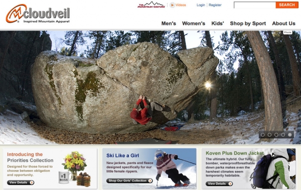
With cooler temperatures around the corner and outdoor enthusiasts ready to stock up on winter gear, Circumerro is excited to announce the launch of the redesigned Cloudveil Fall/Winter 2009 website.
With a focus on fresh visuals, streamlined shopping navigation and social sharing, the new site is a strong testimony to Circumerro’s innovation and expertise in brand engagement and e-commerce.
Taking full advantage of improved visual standards, the project incorporates bigger screen resolutions, rich media capabilities and full-service online shopping technologies.
To refine the online shopping experience, Circumerro partnered with Fluid—an industry-leading performer in media solutions—to bring product page zoom, magnify and streaming video enhancements.
“We aim to continually push the limit on customer and product interaction for all of our e-commerce sites. The Cloudveil project has been and continues to be a crown jewel in our portfolio and we’re thrilled with the results of this redesign,” explained Noah Waterhouse, Creative Services Director at Circumerro.
Social sharing through sites like Facebook, Youtube and Twitter is highlighted through a convenient ShareThis function, along with the addition of user-generated product reviews, allowing shoppers to post, comment and interact with staff and other users.
The site also introduces new partner links to Cloudveil dealers, including Altrec, Backcountry.com, KL Sport and Moosejaw, giving shoppers more options to purchase from other online partners.
“[They] did it again and surpassed my expectations. The new site is beautiful and was delivered as expected and actually ahead of when I predicted…great work by all, thanks for the big push to get this done and all the efforts on improving this important component of our business,” added Steve Sullivan, Founder/President of Cloudveil.
To make traveling easier and to provide solutions for the active everyday and world traveler, Eagle Creek has re-launched www.eaglecreek.com with a bevy of new online travel tools and educational content.
In addition to providing effective page layout and design, the updated EagleCreek.com enhancements provide consumers with efficient and useful navigation to facilitate product education, selection and ultimately purchase vis-à-vis its retail network. Eagle Creek’s 150-plus styles are now easier to find and more effectively presented, with virtually every color way it offers showcased, multiple product photography perspectives (e.g., open, merchandised, on body, etc.), and feature-rich detailed product specifications.
“We set out to deliver a world class site that conveys the Eagle Creek brand ethos and presents our products,” said Eagle Creek Director of Marketing Adam Ziegelman. “We’re working to leverage the web in every way possible to help the consumer gain a better understanding of the products we make and create an ambience on the site that speaks clearly in the Eagle Creek voice.”
Cutting-edge travel tools such as the site’s new interactive “Outfit Me” tool are designed to enhance traveler understanding. “Outfit Me” enables travelers to easily identify product that fits their specific travel needs through a brief Q & A process. Additionally, its online Global Electricity Navigator tool allows travelers to enter a destination to immediately determine what electrical gadgets are required for world travel, while its Pack-It® Video tutorial helps travelers learn how to maximize space and minimize wrinkles when traveling.
In its Travel Tips section, the EagleCreek.com site offers in-depth advice on traveler concerns such as packing advice, vacation planning, traveling light, etc. Packing suggestions, tips, checklists, and other detailed travel insights also are featured in Travel Tips. With the new site, travelers are encouraged to contribute to the online travel community. At EagleCreek.com, travelers may convey their opinions about the brand, submit travel and product images for posting on the site, and freely review the product for others to view.
By offering real traveler product reviews, Eagle Creek believes its customers will better understand the products it sells, and is confident that traveler reviews will help others make better informed luggage purchase decisions. “The new Eagle Creek online brand experience is intended to help the customer understand and experience that travel will be made easier and that they are tapping in to a true travel community when they visit the Eagle Creek site or purchase Eagle Creek products,” added Ziegelman.
After sales support online remains a top priority for Eagle Creek. With this in mind, warranties, customer service, repair services and FAQ resources, are made easily accessible through highly visible navigation design. Concurrent with the consumer-facing Web site, Eagle Creek also has launched a new secure “Pro Purchase Program” eCommerce function, which is linked to the existing direct merchant or internal commerce engine.
The online solution replaces its paper-based, offline pro purchase program. Eagle Creek’s trade only Pro Shop donates five percent of all industry purchases made through the Eagle Creek Pro-Purchase Program eCommerce Pro Shop to The Conservation Alliance, a non-profit organization that supports grassroots citizen-action groups and their efforts to protect wild and natural areas. Eagle Creek’s consumer and trade-only Web sites were created in partnership with Jackson, Wyoming-based Circumerro Creative Group.
Circumerro Creative Group is a division of Circumerro Incorporated. The Group specializes in concept-driven design solutions for traditional and interactive mediums. Core competencies include branding, interactive and graphic design, content management systems, and integrated marketing solutions.
Eagle Creek Eagle Creek is a maker of adventure travel gear, everyday bags, travel accessories and packing solutions for active, adventurous souls. Founded in 1975, California-based Eagle Creek, Inc., invented the adventure travel gear category, introduced the industry’s first convertible backpack on wheels, and is revolutionizing the way travelers pack with its Pack-It® folders, cubes, sacs and toiletry kit organizing system.
