We all enjoy the little details in life that make our experiences simpler and more memorable. The same is true for web and mobile applications. But these little details are anything but little in their role in the user experience as a whole. They make our interaction with the device easier and faster, and sometimes even bring a smile to our faces.

Think about it. When you visit a new website or download a new app, what are the things that make you bookmark the website or keep you from deleting the app? Does the design and functionality enhance your overall experience? Does the application subtly guide you to your desired outcome, helping you along the way without getting in the way? The details might be so subtle that you don’t notice them at first, and maybe you’ve seen them so many times in different applications that they’ve become second nature and even expected.
The first and foremost priority in building a web or mobile application is always to satisfy the needs of the user and the business. Nevertheless, it’s the execution of the basic needs and little details that make all the difference, that make a good application great. Paired with a solid core application—one with good design and functionality, well-written content, and interesting or helpful subject matter—clever details can take the application, and more importantly the user’s experience, to the next level and beyond.
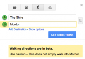
An application that demonstrates an understanding of our needs and desires can be very powerful on an emotional level, alongside the aesthetic and functional levels. For example, have you ever noticed that the street view icon in Google Maps has a surfboard in Hawaii? Or that Google Maps also advises against going to Mordor? These details don’t interrupt the application’s function or get in your way, but they add a touch of personality that makes the application feel less static and more inviting.


Say you’re comparing two new apps with the same basic function. They both look good aesthetically and the writing is clear and meaningful. But one app uses date and time pickers, auto-populates your user information and location, and smoothly handles device orientation changes. The other requires you to type in the date, time and location repeatedly, painstakingly input all your user information, and is forever stuck in landscape orientation. Both apps allow you to achieve the same goal, but the first app makes it much easier and faster. Which would you keep?
Here at Circ, we’re all about paying attention to the little details, about going the extra mile to create the best applications and experiences possible for businesses and their customers alike. And at the end of the day, that’s what counts.

