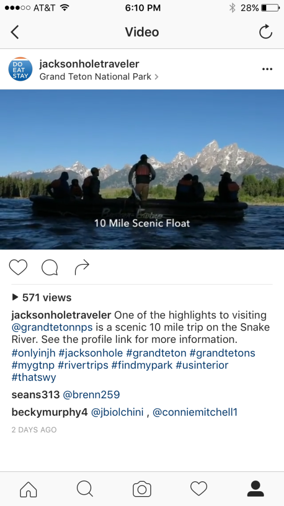
https://www.youtube.com/watch?v=Ql4ypmOOv0E
Circ has been leveraging the value of web video in making short-form videos for our partners. The approach is “light-weight” shooting on the fly with a focus on telling an authentic story that is not over produced. We see on our web sites that our users are trying to validate the brand experiences being sold to them by our partners. They seek it through reading the available press on the business and what the broader travel community is saying on TripAdvisor.
Our videos are meant to target this behavior, giving the view an overview of what they should expect and hopefully move them to connect with the partner to engage in the experience.
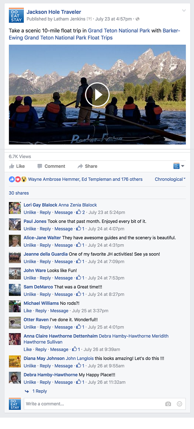
Once the videos are launched they are a great content asset to syndicate through our various marketing channels and that of the partners. You can see below how in Facebook alone we achieved thousands (6K+) of views and great engagement over just a few days. The comments enable us to validate these viewers are brand evangelist and prospects, we are not just entertaining the masses.
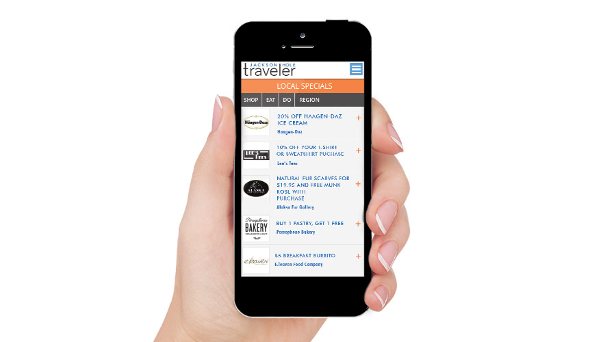
Circ’s Jackson Hole Traveler brand launched free wifi for our town square visitors in late May. Targeting the millions that stroll the wooden boardwalks to shop and eat, we reward them with local business specials, helping our partners channel visitors into their businesses.
To-date the program has been very successful with hundred’s of daily users taking advantage of the free wifi and redeeming the offerings.

Jackson Hole may be small, but it’s a hot bed of design creativity, marketing innovations, and genuine curiosity about new ways to make an impact in today’s evolving consumer climate.
For Jesse Ryan and Ryan Hittner of local digital marketing agency New Thought Media, that new way to make an impact involves a savvy approach to deploying social media across multiple channels. Says Director of Digital Marketing Ryan, “There is a movement in the Jackson Hole business community towards innovation. I think local businesses are looking for ways to provide more than just great products or services, they’re looking for ways to create one-of-a-kind customer experiences. Unique content strategies and interpersonal communication platforms like social media provide a catalyst for innovation.”
The agency, who specialize in social media marketing, content production, pay-per-click, and web development bring an energy and passion to their technical expertise on these matters. Even better? They’re willing to share their insights. In a detailed slide presentation open to the Jackson Hole community at large, the two were quick to emphasize some jaw-dropping statistics on social media engagement. For instance, in 2013, 85% of US internet browsers watched online videos, and of those videos, 25% were ads. Clearly, the field is ripe for businesses, including those in Jackson, to make connections with potential customers via this medium.
From there, the team presented a rundown of popular platforms–from the usual suspects like Facebook to more information-based platforms such as LinkedIn–with tips about what sorts of sharing are best on each. Especially for businesses just beginning to position themselves within their social media brand identities, this was enormously helpful. Most helpful to the Circ team was the explanation of the “Hero, Hub, Hygiene” approach to creating social media videos for the best brand engagement and shareability.
“Great content is all about values, identifying the Why. Why am I here? Why am I creating this product or service? Without first understanding your place in this global community, it is impossible to stand apart,” explains Ryan, and the examples shared from diverse brands such as local interior design firm WRJ and John Lewis, a fashion brand, helped to underline this.
From start to finish, the presentation provided much in the way of simple takeaways that any local business could begin implementing, even on a budget. The engaged audience lingered behind to ask questions and glean more tips as well.
“The social media luncheon far exceeded our expectations. Everybody who attended seemed hungry for new ideas and creative solutions. Jackson is full of incredibly talented entrepreneurs. It is great to be in a position to help them succeed,” enthused Creative Director Ryan Hittner.
Looking forward, this is clearly a time for Jackson Hole entrepreneurs to capitalize on free sharing platforms, imagery, and yes, video. Even videos created on iPhones can create large returns in terms of engagement. Thanks to the team at New Thought Media for sharing their professional acumen on the subject.
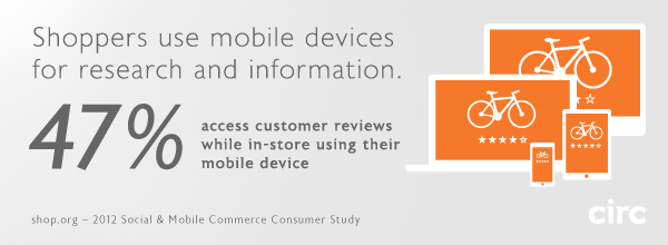
When shaping the strategy for a web site or application in planning and budgeting efforts, it’s essential to consider the mobile solutions needed to be successful.
The studies are in, and all signs point to a massive increase in customer activity on mobile devices. Studies by Forrester, comScore, Gartner, and Nielsen reported similar findings in the neighborhood of an 81% percent increase in mobile eCommerce spending in 2012, totaling nearly $25 Billion. By 2016, conservative projections suggest nearly 30% of eCommerce spending will take place on smartphones and tablets.
eCommerce Brands can’t afford to ignore mobile channels, an area in which most online retailers are notoriously weak. However, since budgets and timelines are a factor, sometimes we have to make a choice as to what degree we can afford to optimize a web site or web application for multiple devices. Will a responsive layout suffice, or will a multiscreen ecosystem be required to create the best experience for your customers? Most importantly, it matters to your users, who ultimately hold the success of your site or app in their hands.
Circ considers the following three levels of optimization in the design and development of web sites and applications, to effectively reach customers in mobile channels.
Level 1: Mobile compatibility
Minimum viable solution; low-quality user experience.
At Circ, mobile compatibility is standard practice in web site and web application design and development, and if your site does not fully support this level of compatibility, it’s time to press the issue. Level 1 compatibility means the full functionality of the design will render effectively on any browser-enabled device. Flash and other tools or scripts that are not fully supported by tablets and mobile phones should simply not be used. At this point in time, tablets and mobile phones are primarily touchscreen devices, so all interactions within the site or application must be supported by touch UI libraries. At Level 1, the site or application is fully optimized for desktop browsers, but will scale down in size to fit smaller tablet and mobile phone displays. While the user experience is somewhat cumbersome, at least the site or app can be zoomed and scrolled effectively such that all content and functionality is fully accessible.
Level 2: Responsive layout
The sweet spot for mobile optimization; dramatically improved user experience.
One could argue that responsive layouts are already standard practice as well. But in the context of time and budget, caring for the wide range of viewport sizes of tablets and mobile phones in a responsive layout constitutes a significant effort – which might explain why so many businesses have not sufficiently addressed mobile solutions until now. Circ’s Level 2 optimizations meet all Level 1 requirements, and in addition, the UI and page layouts are crafted to respond to the device viewport rather than simply scaling down the site to fit. A responsive layout provides that most (or all) of the information and functionality available in a desktop site or app must also be retained and displayed on tablets and phones. This is where the challenge of designing appropriate interfaces for the countless viewport sizes, in both portrait and landscape orientations, becomes a requirement. It’s important to note that Level 2 efforts and greater are best decided upon in early planning stages. While it’s certainly feasible to optimize a site or app by retrofitting or extending the interface to meet multiple display requirements, a great deal of modification to the code base will likely be required for the best solution.
Level 3: Design by context
More than just optimization, a multiscreen ecosystem; ideal user experience.
At this level, we’re addressing the combined use of multiple devices in varying contexts, as part of a single product. The assumption is that the site or app could be used at home, at work, and on the go using any number of web-enabled tools. Depending on the purpose of your site or app, certain tasks and information supported on desktop and tablet browsers may not be relevant or appropriate in a mobile environment. Do users need complete access to all tasks and information? Or will a specific subset of features deliver a better experience for users on the go? Take it a step further, into the creation of a multiscreen ecosystem – how do the contexts of use of any device (desktop, laptop, tablet, mobile phone, even SmartTVs) play a role in a seamless experience? This UX Magazine article thoroughly addresses the topic in great clarity.
For many businesses a mobile site will suffice, but the benefits of a native app (iOS, Android, Windows Phone) are huge. Performance, usability, offline viewing, push notifications, and tie-ins to the device’s other features like payment options and addresses are just a few. Native apps give your brand a reliable presence on the user’s device, and can be seamlessly launched from a link on a web site or email. At Circ, we leverage design and programming efficiencies that can make the creation of combined mobile site and native app platforms a more viable solution for businesses that require them.

Circ client, STM Bags, has been recognized by iLounge as “2012 Accessory Maker of the Year,” the site’s annual Readers’ Choice award.
If you’re a hoarder of Apple iDevices, you may have heard of iLounge, one of the most comprehensive publishers of reports and information about Apple’s mobile products and the myriad of related accessories. At over 20 million page hits each month, iLounge has become a go-to source with it’s editorial reviews, forums, and resources for informed iConsumers.
Since our initial design and launch of stmbags.com in the spring of 2010, Circ has been a part of the creative and technical force behind STM’s website, helping the company reach retailers and customers online. At Circ, we feel an enormous sense of pride when a client brand is appreciated for quality, creativity, and excellence in their market. Congratulations to our colleagues at STM, notably Adam Ziegelman and team.
An excerpt from the press release:
SAN DIEGO, /PRNewswire/ —
Leading Australian bag and case manufacturer STM has won the prestigious iLounge Apple Accessory Maker of the Year Award. iLounge’s annual Readers’ Choice Awards recognizes third party developers for their excellent work throughout the year.
“We are thrilled to be recognized by iLounge and their readers,” said Adina Jacobs, STM’s co-founder. “It is always nice to be acknowledged as a leader in your field and coming from iLounge makes it more special.”
“After thousands of votes—and very passionate, neck-and-neck tallies up to the very last minute—STM prevailed as iLounge’s Readers’ Choice for Accessory Developer of the Year,” explained Jeremy Horwitz, iLounge’s Editor-in-Chief. “Our editors have loved STM’s bags for years, and have been thrilled to see its recent and impressive expansions into iPad and iPhone case development. We can’t wait to see what’s next.”
Hundreds of new Apple products are tested every year by iLounge. For the Readers’ Choice Awards, iLounge nominated a select group of organizations deemed by their editors as leaders in their respective fields. Winners were determined solely by thousands of iLounge readers who cast their votes throughout the month of October. STM joins other 2012 winners such as Google, Apple, JBL and Disney.
—
Learn more about STM Bags at www.stmbags.com.
We all enjoy the little details in life that make our experiences simpler and more memorable. The same is true for web and mobile applications. But these little details are anything but little in their role in the user experience as a whole. They make our interaction with the device easier and faster, and sometimes even bring a smile to our faces.
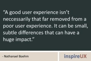
Think about it. When you visit a new website or download a new app, what are the things that make you bookmark the website or keep you from deleting the app? Does the design and functionality enhance your overall experience? Does the application subtly guide you to your desired outcome, helping you along the way without getting in the way? The details might be so subtle that you don’t notice them at first, and maybe you’ve seen them so many times in different applications that they’ve become second nature and even expected.
The first and foremost priority in building a web or mobile application is always to satisfy the needs of the user and the business. Nevertheless, it’s the execution of the basic needs and little details that make all the difference, that make a good application great. Paired with a solid core application—one with good design and functionality, well-written content, and interesting or helpful subject matter—clever details can take the application, and more importantly the user’s experience, to the next level and beyond.
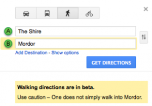
An application that demonstrates an understanding of our needs and desires can be very powerful on an emotional level, alongside the aesthetic and functional levels. For example, have you ever noticed that the street view icon in Google Maps has a surfboard in Hawaii? Or that Google Maps also advises against going to Mordor? These details don’t interrupt the application’s function or get in your way, but they add a touch of personality that makes the application feel less static and more inviting.

Say you’re comparing two new apps with the same basic function. They both look good aesthetically and the writing is clear and meaningful. But one app uses date and time pickers, auto-populates your user information and location, and smoothly handles device orientation changes. The other requires you to type in the date, time and location repeatedly, painstakingly input all your user information, and is forever stuck in landscape orientation. Both apps allow you to achieve the same goal, but the first app makes it much easier and faster. Which would you keep?
Here at Circ, we’re all about paying attention to the little details, about going the extra mile to create the best applications and experiences possible for businesses and their customers alike. And at the end of the day, that’s what counts.

Circ worked with HealthCommunities.com to redesign and rebuild their web content structure and interface, and prepare it for Content Management integration. The success of the design has enabled the HealthCommunities brand to leverage the editorial assets of its parent company, Remedy Health Media, create a renewed focus, convert user registration, and foster ongoing engagement.
As part of Remedy Health Media‘s trusted family of award winning products, HealthCommunities.com is an online health and wellness resource that covers over 650 diseases and conditions and offers a range of articles, tools, and apps on health topics for women, men, kids, and even pets. HealthCommunities.com adds value to the lives of its audience on a daily basis by serving as an interactive hub for all things “Health,” and develops meaningful conversations within its user-base.
But even with a strong parent brand and comprehensive offering, the HealthCommunites.com brand is challenged to differentiate itself in a crowded environment entrenched with major players like WebMD.com and EverydayHealth.com.
To improve the user experience and brand differentiation, Circ provided HealthCommunities.com with:
– New, clear, information architecture
– A clean, fresh, open experience with a friendly and intuitive user interface
– Functionality that is suited for both desktop and mobile environments
– Improved, consistent navigation accessing health topic landing pages and dynamic article pages
– Interactive tools for social sharing and audience participation via polls and quizzes
– Seamless integration of content and products from partners Johns Hopkins and UC Berkeley
– Integration of the Remedy Health Media suite of tools and apps
At Circ, we understand that all great brands live in conversations, and we design new and creative ways to engage consumer audiences. To that end, the HealthCommunities.com design was a strategic effort in the evolution of their brand. Partnering with HealthCommunities.com has not only sparked meaningful conversations within its user-base, allowing more positive relationships to form between the brand and its consumers, but has also lead to positive business results for our client and ourselves.
“We had a really solid partner in Circ for this project,” says Patrick Assey, EVP of Digital at Remedy Health Media. “They understood our challenges and goals and worked with us diligently to overhaul our site experience. The outcome is a site that’s much more intuitive—one that has end-users and advertisers alike singing our praises!”
As any marketer will tell you, introducing a new brand to the marketplace is a big task—one filled with many exciting possibilities, but requirements and unknowns as well. What’s the brand story? What’s the platform where we’re going to tell it? And most importantly, how are we going to get people engaging with, talking about, and buying the product?
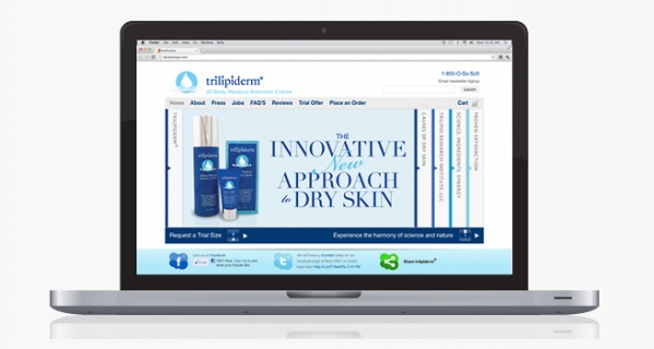
This was exactly the case as Circ partnered with the TriLipid Research Institute LLC to facilitate a website market test for their skincare brand Trilipiderm®. After helping launch the product, it became clear that we needed to evolve the brand story on the website. But we needed to do it within the confines of their existing ecommerce platform, Shopify, and enable access and engagement from the homepage.
The new homepage has interactive features like sliding panes, scrolling images, imbedded videos, and buttons for expanded reading. For the brand, presenting its evolved story to the world and engaging customers is an important step in its growth. Plus, incorporating keywords and authoritative content boosts the brand’s search rankings, bringing potential new customers to the site.
For Circ, the new homepage is a creative solution that meets the client’s needs within specific guidelines on the Shopify platform. It’s a fresh aesthetic with optimized content in a sticky, interactive feature, and it’s all in one place.
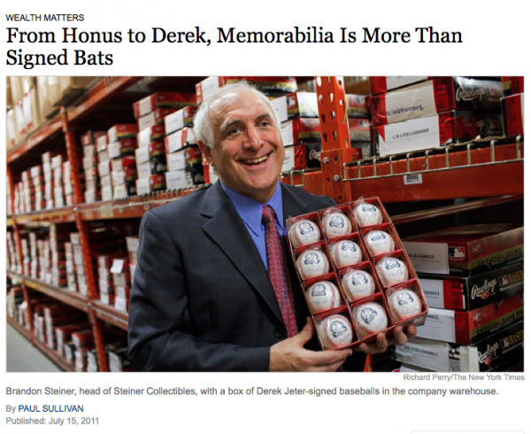
It seems that when Derek Jeter hit his 3,000th hit on July 9th, everyone wanted something that the Yankees’ living legend had signed, touched, or even walked on. That’s why the New York Times just featured our client, top memorabilia shop Steiner Sports, as baseball’s go-to online warehouse for sports collector items.

From dugout dirt to signed baseballs and game-used bats, Steiner Sports is the headquarters for any-and-all kinds of baseball collector items. And they don’t stop at baseball—the website features all manner of sports memorabilia from hockey to horse racing.
Steiner Sports asked Circumerro to design their website back in spring 2011, and we couldn’t be prouder of their coverage in the Times, or of the tidal wave of orders they experienced over Jeter’s 3000th hit.
So if you’re looking for anything from a signed photo, to game-worn pants, from autographed helmets to bricks from old Yankees stadium, stop by Steinersports.com, where Circumerro’s creative work connects fans with their favorite sports memorabilia.

We signed Steiner Sports as a client! Based in New Rochelle, New York, Steiner Sports is a leader in autographed sports memorabilia and sports collectibles. Circumerro is charged with concepting and designing a new website.
“Steiner Sports is the top dog in sports memorabilia & collectibles. They recognized our work in eCommerce and creating sites that convince and convert,” said Latham Jenkins, president of Circumerro Media.
The new site, once completed with Circumerro’s eCommerce partner, Acadaca, will be launched in the fall of 2010.
About Steiner Sports
Steiner Sports Memorabilia entered the sports business world in 1987 and has established itself as the leader in autographed sports memorabilia and sports collectibles. Their full line authentic autographed collectibles are the best source for all your gift needs. They have the perfect sports gifts for birthdays or unique gift for men (groomsman gifts or anniversary gifts). The current best-selling autographed memorabilia are items from: Yankees, Red Sox, Cowboys, Giants, Rangers, Mets, Celtics, Alabama Football Memorabilia, Notre Dame Football, Derek Jeter, Alex Rodriguez, Eli Manning, Mark Buehrle, Brett Favre, Mark Teixeira and Mariano Rivera. Featured this month are special collectibles featuring World Series memorabilia from the New York Yankees and Philadelphia Phillies.

