Circ’s brand Homestead Magazine just finished its 2015 Jackson Hole Showcase of Homes event. The Showcase of Homes is a two-day, self-guided fundraising tour with a superb catch: face-to-face conversations with these accomplished professionals. More than the ordinary walk-through, the Jackson Hole Showcase of Homes puts attendee and professional on a first-name basis. Each artisan in architecture, construction, interior design, landscaping and electronic systems will be on hand to reveal the art—and perhaps the magic—behind their achievement in some of Jackson Hole’s most exciting new homes.
See the 2105 Jackson Hole Showcase of Homes wrap article and we hope you join us in 2016.

Our 2015 event is the largest to-date, featuring six spectacular homes throughout the valley!
Jackson Hole, Wyo. – September 08th, 2015 – The Jackson Hole Showcase of Homes, now in its third year, is pleased to announce its largest fundraising event to-date taking place during the Jackson Hole Fall Arts Festival. Featuring six magnificent homes spread throughout the valley—from Teton Village to Fish Creek to the Snake River Sporting Club—the self-guided home tours offer attendees a broad representation of local design and geography. Most importantly, the Showcase of Homes distinguishes itself by providing opportunities for patrons to meet the design professionals who helped create each home.
“We view the event as an immersive presentation of the talented designers we have in Jackson Hole. Giving our attendees the chance to speak first hand with the architects, interior, and exterior designers who are responsible for each project has always been the centerpiece of our event,” says Latham Jenkins, event founder and publisher of Homestead Magazine, which hosts Showcase.
This year, the selected homes range from classical log construction to contemporary mountain living, allowing a fully rounded glimpse into the question of how one can live—and design for—Jackson Hole’s unique landscape and lifestyle.
The Showcase team invites patrons to attend and be inspired by the home designs, the design professionals, and the diverse settings of Jackson Hole. Purchasing tickets also represents a chance to give back to worthy local causes. Each year, tour homeowners select the beneficiaries for all ticket sale proceeds. 2015’s regional non-profit beneficiaries include the Jackson Hole Land Trust, the Grand Teton National Park Foundation, and the Wyoming chapter of the Nature Conservancy.
Jackson Hole Showcase of Homes occurs on both Friday, September 18th and Saturday, September 19th during the second weekend of the Jackson Hole Fall Arts Festival from 11 a.m. – 4 p.m. Tickets are limited to 250 attendees and are available for $75.00 online at JacksonHoleShowcase.com. The tours are self-guided, which means that ticket holders can visit houses in whichever order they choose, and have the option to spread home visits out over two days.
About Jackson Hole Showcase of Homes
Jackson Hole Showcase of Homes is a two-day, self-guided fundraising tour with a superb catch: face-to-face conversations with the accomplished professionals behind each home. More than an ordinary walk-through, the Jackson Hole Showcase of Homes puts attendee and professional on a first-name basis. Each artisan in architecture, construction, interior design, landscaping and electronic systems will be on hand to reveal the art—and perhaps the magic—behind their achievement in some of Jackson Hole’s most exciting new homes. See more at: JacksonHoleShowcase.com.
About Homestead Magazine
Homestead Magazine is Jackson Hole’s premier resource for art, architecture, real estate, and interior design. With a focus on the blend of western and contemporary design that is so?unique to the Rocky Mountain West, Homestead Magazine serves many functions in the Jackson community. It is a directory of local resources; an editorial publication featuring original articles and photography; a showcase of work by top architects, artists, builders, designers, and artisans; and a source of inspiration for anyone building, buying, or decorating a home. Visit HomesteadMag.com for a free subscription.
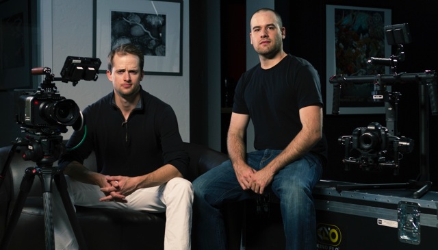
Jackson Hole may be small, but it’s a hot bed of design creativity, marketing innovations, and genuine curiosity about new ways to make an impact in today’s evolving consumer climate.
For Jesse Ryan and Ryan Hittner of local digital marketing agency New Thought Media, that new way to make an impact involves a savvy approach to deploying social media across multiple channels. Says Director of Digital Marketing Ryan, “There is a movement in the Jackson Hole business community towards innovation. I think local businesses are looking for ways to provide more than just great products or services, they’re looking for ways to create one-of-a-kind customer experiences. Unique content strategies and interpersonal communication platforms like social media provide a catalyst for innovation.”
The agency, who specialize in social media marketing, content production, pay-per-click, and web development bring an energy and passion to their technical expertise on these matters. Even better? They’re willing to share their insights. In a detailed slide presentation open to the Jackson Hole community at large, the two were quick to emphasize some jaw-dropping statistics on social media engagement. For instance, in 2013, 85% of US internet browsers watched online videos, and of those videos, 25% were ads. Clearly, the field is ripe for businesses, including those in Jackson, to make connections with potential customers via this medium.
From there, the team presented a rundown of popular platforms–from the usual suspects like Facebook to more information-based platforms such as LinkedIn–with tips about what sorts of sharing are best on each. Especially for businesses just beginning to position themselves within their social media brand identities, this was enormously helpful. Most helpful to the Circ team was the explanation of the “Hero, Hub, Hygiene” approach to creating social media videos for the best brand engagement and shareability.
“Great content is all about values, identifying the Why. Why am I here? Why am I creating this product or service? Without first understanding your place in this global community, it is impossible to stand apart,” explains Ryan, and the examples shared from diverse brands such as local interior design firm WRJ and John Lewis, a fashion brand, helped to underline this.
From start to finish, the presentation provided much in the way of simple takeaways that any local business could begin implementing, even on a budget. The engaged audience lingered behind to ask questions and glean more tips as well.
“The social media luncheon far exceeded our expectations. Everybody who attended seemed hungry for new ideas and creative solutions. Jackson is full of incredibly talented entrepreneurs. It is great to be in a position to help them succeed,” enthused Creative Director Ryan Hittner.
Looking forward, this is clearly a time for Jackson Hole entrepreneurs to capitalize on free sharing platforms, imagery, and yes, video. Even videos created on iPhones can create large returns in terms of engagement. Thanks to the team at New Thought Media for sharing their professional acumen on the subject.
The last few months at Circ have been a flurry of excitement and creativity as we prepared to bring the newly revamped Jackson Hole Traveler to market. Now, it’s out, and we’re gearing up for a big push in advertiser storytelling, comprehensive editorial, and the simultaneous launch of our brand spankin’ new web platform in the months to come.
What’s new in Traveler this year? Here’s what you need to know, directly from our publisher:
The new Traveler is poised to reach more people than ever before in two ways: our combined print and online platform featuring Premium Digital Profiles for businesses, and the largest circulation of any print guide in the valley.
Our passion lies in connecting visitors to Jackson Hole’s most unforgettable experiences: we want them to find the perfect place to set up their camera tripods, or book the ideal raft-and-fish adventure. That’s where our research comes in. After speaking with local guest services professionals, we realized we needed to offer tools to travelers at all stages of the decision-making process.
For example: visitors can search for lodging from a mobile device on jacksonholetraveler.com. Read curated itineraries or interact with our interpretive fold-out map of Grand Teton National Park. Pick up on locally acclaimed cuisine and head right to the web to make a reservation. However travelers make decisions, Jackson Hole Traveler is there to help.
Here at Traveler, we have always been committed to storytelling. Now, through engaging advertorials, we are poised to tell the story of valley businesses in a way that will reach millions of readers. We couldn’t be more excited.
Interested in joining the pages of Jackson Hole Traveler? Contact us today at info@circ.biz or (307) 733-8319.

The Wyoming Business Report recently published a story on Circumerro’s launch of the EpicQuest website. Known for aggressive and comprehensive business reporting, the WBR covers news through a range of mediums, including a traditional printed monthly business journal, web-based news and an daily e-newsletter.
Circumerro worked closely with EpicQuest to develop a web experience that accurately shares the story of the firm’s pioneering efforts in the world of adventure travel.
Check out the full text of the report here.
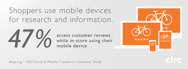
When shaping the strategy for a web site or application in planning and budgeting efforts, it’s essential to consider the mobile solutions needed to be successful.
The studies are in, and all signs point to a massive increase in customer activity on mobile devices. Studies by Forrester, comScore, Gartner, and Nielsen reported similar findings in the neighborhood of an 81% percent increase in mobile eCommerce spending in 2012, totaling nearly $25 Billion. By 2016, conservative projections suggest nearly 30% of eCommerce spending will take place on smartphones and tablets.
eCommerce Brands can’t afford to ignore mobile channels, an area in which most online retailers are notoriously weak. However, since budgets and timelines are a factor, sometimes we have to make a choice as to what degree we can afford to optimize a web site or web application for multiple devices. Will a responsive layout suffice, or will a multiscreen ecosystem be required to create the best experience for your customers? Most importantly, it matters to your users, who ultimately hold the success of your site or app in their hands.
Circ considers the following three levels of optimization in the design and development of web sites and applications, to effectively reach customers in mobile channels.
Level 1: Mobile compatibility
Minimum viable solution; low-quality user experience.
At Circ, mobile compatibility is standard practice in web site and web application design and development, and if your site does not fully support this level of compatibility, it’s time to press the issue. Level 1 compatibility means the full functionality of the design will render effectively on any browser-enabled device. Flash and other tools or scripts that are not fully supported by tablets and mobile phones should simply not be used. At this point in time, tablets and mobile phones are primarily touchscreen devices, so all interactions within the site or application must be supported by touch UI libraries. At Level 1, the site or application is fully optimized for desktop browsers, but will scale down in size to fit smaller tablet and mobile phone displays. While the user experience is somewhat cumbersome, at least the site or app can be zoomed and scrolled effectively such that all content and functionality is fully accessible.
Level 2: Responsive layout
The sweet spot for mobile optimization; dramatically improved user experience.
One could argue that responsive layouts are already standard practice as well. But in the context of time and budget, caring for the wide range of viewport sizes of tablets and mobile phones in a responsive layout constitutes a significant effort – which might explain why so many businesses have not sufficiently addressed mobile solutions until now. Circ’s Level 2 optimizations meet all Level 1 requirements, and in addition, the UI and page layouts are crafted to respond to the device viewport rather than simply scaling down the site to fit. A responsive layout provides that most (or all) of the information and functionality available in a desktop site or app must also be retained and displayed on tablets and phones. This is where the challenge of designing appropriate interfaces for the countless viewport sizes, in both portrait and landscape orientations, becomes a requirement. It’s important to note that Level 2 efforts and greater are best decided upon in early planning stages. While it’s certainly feasible to optimize a site or app by retrofitting or extending the interface to meet multiple display requirements, a great deal of modification to the code base will likely be required for the best solution.
Level 3: Design by context
More than just optimization, a multiscreen ecosystem; ideal user experience.
At this level, we’re addressing the combined use of multiple devices in varying contexts, as part of a single product. The assumption is that the site or app could be used at home, at work, and on the go using any number of web-enabled tools. Depending on the purpose of your site or app, certain tasks and information supported on desktop and tablet browsers may not be relevant or appropriate in a mobile environment. Do users need complete access to all tasks and information? Or will a specific subset of features deliver a better experience for users on the go? Take it a step further, into the creation of a multiscreen ecosystem – how do the contexts of use of any device (desktop, laptop, tablet, mobile phone, even SmartTVs) play a role in a seamless experience? This UX Magazine article thoroughly addresses the topic in great clarity.
For many businesses a mobile site will suffice, but the benefits of a native app (iOS, Android, Windows Phone) are huge. Performance, usability, offline viewing, push notifications, and tie-ins to the device’s other features like payment options and addresses are just a few. Native apps give your brand a reliable presence on the user’s device, and can be seamlessly launched from a link on a web site or email. At Circ, we leverage design and programming efficiencies that can make the creation of combined mobile site and native app platforms a more viable solution for businesses that require them.

Circ client, STM Bags, has been recognized by iLounge as “2012 Accessory Maker of the Year,” the site’s annual Readers’ Choice award.
If you’re a hoarder of Apple iDevices, you may have heard of iLounge, one of the most comprehensive publishers of reports and information about Apple’s mobile products and the myriad of related accessories. At over 20 million page hits each month, iLounge has become a go-to source with it’s editorial reviews, forums, and resources for informed iConsumers.
Since our initial design and launch of stmbags.com in the spring of 2010, Circ has been a part of the creative and technical force behind STM’s website, helping the company reach retailers and customers online. At Circ, we feel an enormous sense of pride when a client brand is appreciated for quality, creativity, and excellence in their market. Congratulations to our colleagues at STM, notably Adam Ziegelman and team.
An excerpt from the press release:
SAN DIEGO, /PRNewswire/ —
Leading Australian bag and case manufacturer STM has won the prestigious iLounge Apple Accessory Maker of the Year Award. iLounge’s annual Readers’ Choice Awards recognizes third party developers for their excellent work throughout the year.
“We are thrilled to be recognized by iLounge and their readers,” said Adina Jacobs, STM’s co-founder. “It is always nice to be acknowledged as a leader in your field and coming from iLounge makes it more special.”
“After thousands of votes—and very passionate, neck-and-neck tallies up to the very last minute—STM prevailed as iLounge’s Readers’ Choice for Accessory Developer of the Year,” explained Jeremy Horwitz, iLounge’s Editor-in-Chief. “Our editors have loved STM’s bags for years, and have been thrilled to see its recent and impressive expansions into iPad and iPhone case development. We can’t wait to see what’s next.”
Hundreds of new Apple products are tested every year by iLounge. For the Readers’ Choice Awards, iLounge nominated a select group of organizations deemed by their editors as leaders in their respective fields. Winners were determined solely by thousands of iLounge readers who cast their votes throughout the month of October. STM joins other 2012 winners such as Google, Apple, JBL and Disney.
—
Learn more about STM Bags at www.stmbags.com.
We all enjoy the little details in life that make our experiences simpler and more memorable. The same is true for web and mobile applications. But these little details are anything but little in their role in the user experience as a whole. They make our interaction with the device easier and faster, and sometimes even bring a smile to our faces.
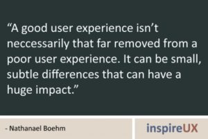
Think about it. When you visit a new website or download a new app, what are the things that make you bookmark the website or keep you from deleting the app? Does the design and functionality enhance your overall experience? Does the application subtly guide you to your desired outcome, helping you along the way without getting in the way? The details might be so subtle that you don’t notice them at first, and maybe you’ve seen them so many times in different applications that they’ve become second nature and even expected.
The first and foremost priority in building a web or mobile application is always to satisfy the needs of the user and the business. Nevertheless, it’s the execution of the basic needs and little details that make all the difference, that make a good application great. Paired with a solid core application—one with good design and functionality, well-written content, and interesting or helpful subject matter—clever details can take the application, and more importantly the user’s experience, to the next level and beyond.
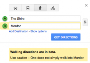
An application that demonstrates an understanding of our needs and desires can be very powerful on an emotional level, alongside the aesthetic and functional levels. For example, have you ever noticed that the street view icon in Google Maps has a surfboard in Hawaii? Or that Google Maps also advises against going to Mordor? These details don’t interrupt the application’s function or get in your way, but they add a touch of personality that makes the application feel less static and more inviting.

Say you’re comparing two new apps with the same basic function. They both look good aesthetically and the writing is clear and meaningful. But one app uses date and time pickers, auto-populates your user information and location, and smoothly handles device orientation changes. The other requires you to type in the date, time and location repeatedly, painstakingly input all your user information, and is forever stuck in landscape orientation. Both apps allow you to achieve the same goal, but the first app makes it much easier and faster. Which would you keep?
Here at Circ, we’re all about paying attention to the little details, about going the extra mile to create the best applications and experiences possible for businesses and their customers alike. And at the end of the day, that’s what counts.
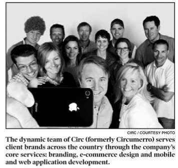
Looks like we’re not the only ones who think our new identity is newsworthy: the Jackson Hole News and Guide covered our name and strategy change in their Business Focus section, highlighting Circ as one of Jackson’s growing and evolving businesses. In case you didn’t catch us in the paper, check out the coverage below:
After 17 years in business, Circumerro Media has shortened its name to Circ.
“We’re rolling out an updated identity this month that reflects our successful evolution as a company and the work we are doing today,” Latham Jenkins, founder and president, said. “Circumerro is a Latin word that means to travel, which historically has been our focus.”
Circ’s local publications, Jackson Hole Traveler and Homestead, have been great successes for the agency. Advertisers in these publications have sustained the company during the last 17 years, helping to grow Circ’s creative services. The design agency now serves client brands across the country through its core services: branding, e-commerce design, and mobile and web application development.
Circ’s clients span various industries, such as health care, online media, technology, apparel and artificial surfacing. Its client roster has included companies like Cigna, Remedy Health Media, Dell, XGrass and Cloudveil.
“Over the years, nearly everyone who has touched the agency has come to call it “Circ,” and it seemed only natural to embrace the shortened name,” Jenkins said. “The change of the name and identity reflects the evolution of the company’s brand and the work that defines the company now.”
Today, Circ is a multidisciplinary communication design agency. Recently, much of Circ’s work has been a response to the disruption that new technologies create for businesses and the need to build brand experiences that address it. Whether it’s designing e-commerce websites and mobile platforms or building more unified digital strategies, Circ thrives on creating value within digital channels that deliver engaging brand experiences and build brand loyalty.
Circ understands that word-of-mouth is one of the most effective means by which experiences are shared, and to leverage that kind sharing, businesses need to engage their audiences and create conversations around their brand. Circ represents the circular nature of these conversations and is expressed in its new tag-line: “Great brands live in conversation.”
—Katy Niner
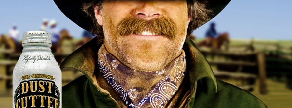
Not long ago, Dust Cutter consulted Circ about extending their startup beverage brand into sales collateral and social media. Dust Cutter is a family recipe of Lemonade and Lemon Tea from the Warm Springs Ranch in Jackson Hole, Wyoming. As you could only expect, the brand has a true-to-life cowboy backstory that’s as iconic as it is authentic.
As the story goes, in the Old West, after a long day on the dusty trail, fresh squeezed lemonade was just the thing to cut your thirst. If you’re not already picturing Clint Eastwood or Sam Elliot, I’d love to hear what did come to mind. For us, the ubiquitous yet mysterious persona of the cowboy lends itself perfectly for a close up photo of a thick dusty moustache.
Looking around, one can find all kinds of moustache propaganda for creative inspiration.
Surely, you can recall one of the most memorable and longest running campaigns featuring the moustache, the celebrity “Milk Mustache” concept by MilkPEP. Adopting Goodby, Silverstein & Partners 1993 “Got Milk?” slogan, MilkPEP began their celebrity campaign in 1995 with Naomi Campbell. Fast forward to 2012—hundreds of celebrity milk moustaches later—and we see our summer Olympians sporting the same distinctive white lip we’ve all come to associate with “Got Milk?”


If for some reason, over the last decade, you haven’t heard of “Movember,” now is as good a time as any to become one of over a million Moustache growers in support of changing the face of men’s health each year (ladies too!). According to the official rules, Mo Bros begin the month of November clean shaven—then groom and shape their show of support throughout the month. Together with the Prostate Cancer Foundation and Livestrong, Movember has raised over $175M to date.

Also, we can’t fail to acknowledge our friends at Wieden+Kennedy for bringing us actor Isaiah Mustafa, in a hilarious series of spots for Old Spice. Clearly, a thick moustache… on a well groomed man… on a boat… is a recipe for brilliance.
From milk to Movember, from deodorant to beer, moustaches are everywhere.
We introduced the Dust Cutter cowboy on Facebook in April, 2012, proud to contribute the old west cookie duster story to the annals of moustache-driven advertising. As we continue to help grow the brand, we’ll keep our eyes out for new takes on this irresistible feature of male grooming in the public sphere. Like this new spot we saw just last week during the NBA playoffs (also from Wieden+Kennedy… is there a trend here?) for Heineken Light, representing the handlebar:
With so many moustache ads currently in play, we couldn’t possibly mention them all here. So, feel free to comment and contribute your favorites in this space.
