3 Levels of Mobile Solutions eCommerce Brands Can’t Afford to Ignore

When shaping the strategy for a web site or application in planning and budgeting efforts, it’s essential to consider the mobile solutions needed to be successful.
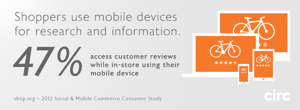
The studies are in, and all signs point to a massive increase in customer activity on mobile devices. Studies by Forrester, comScore, Gartner, and Nielsen reported similar findings in the neighborhood of an 81% percent increase in mobile eCommerce spending in 2012, totaling nearly $25 Billion. By 2016, conservative projections suggest nearly 30% of eCommerce spending will take place on smartphones and tablets.
eCommerce Brands can’t afford to ignore mobile channels, an area in which most online retailers are notoriously weak. However, since budgets and timelines are a factor, sometimes we have to make a choice as to what degree we can afford to optimize a web site or web application for multiple devices. Will a responsive layout suffice, or will a multiscreen ecosystem be required to create the best experience for your customers? Most importantly, it matters to your users, who ultimately hold the success of your site or app in their hands.
Circ considers the following three levels of optimization in the design and development of web sites and applications, to effectively reach customers in mobile channels.
Level 1: Mobile compatibility
Minimum viable solution; low-quality user experience.
At Circ, mobile compatibility is standard practice in web site and web application design and development, and if your site does not fully support this level of compatibility, it’s time to press the issue. Level 1 compatibility means the full functionality of the design will render effectively on any browser-enabled device. Flash and other tools or scripts that are not fully supported by tablets and mobile phones should simply not be used. At this point in time, tablets and mobile phones are primarily touchscreen devices, so all interactions within the site or application must be supported by touch UI libraries. At Level 1, the site or application is fully optimized for desktop browsers, but will scale down in size to fit smaller tablet and mobile phone displays. While the user experience is somewhat cumbersome, at least the site or app can be zoomed and scrolled effectively such that all content and functionality is fully accessible.
Level 2: Responsive layout
The sweet spot for mobile optimization; dramatically improved user experience.
One could argue that responsive layouts are already standard practice as well. But in the context of time and budget, caring for the wide range of viewport sizes of tablets and mobile phones in a responsive layout constitutes a significant effort – which might explain why so many businesses have not sufficiently addressed mobile solutions until now. Circ’s Level 2 optimizations meet all Level 1 requirements, and in addition, the UI and page layouts are crafted to respond to the device viewport rather than simply scaling down the site to fit. A responsive layout provides that most (or all) of the information and functionality available in a desktop site or app must also be retained and displayed on tablets and phones. This is where the challenge of designing appropriate interfaces for the countless viewport sizes, in both portrait and landscape orientations, becomes a requirement. It’s important to note that Level 2 efforts and greater are best decided upon in early planning stages. While it’s certainly feasible to optimize a site or app by retrofitting or extending the interface to meet multiple display requirements, a great deal of modification to the code base will likely be required for the best solution.
Level 3: Design by context
More than just optimization, a multiscreen ecosystem; ideal user experience.
At this level, we’re addressing the combined use of multiple devices in varying contexts, as part of a single product. The assumption is that the site or app could be used at home, at work, and on the go using any number of web-enabled tools. Depending on the purpose of your site or app, certain tasks and information supported on desktop and tablet browsers may not be relevant or appropriate in a mobile environment. Do users need complete access to all tasks and information? Or will a specific subset of features deliver a better experience for users on the go? Take it a step further, into the creation of a multiscreen ecosystem – how do the contexts of use of any device (desktop, laptop, tablet, mobile phone, even SmartTVs) play a role in a seamless experience? This UX Magazine article thoroughly addresses the topic in great clarity.
For many businesses a mobile site will suffice, but the benefits of a native app (iOS, Android, Windows Phone) are huge. Performance, usability, offline viewing, push notifications, and tie-ins to the device’s other features like payment options and addresses are just a few. Native apps give your brand a reliable presence on the user’s device, and can be seamlessly launched from a link on a web site or email. At Circ, we leverage design and programming efficiencies that can make the creation of combined mobile site and native app platforms a more viable solution for businesses that require them.

